You made it with AI. We tell you what will actually build — then we build it.
More and more people walk in with a picture they generated on their phone. A storefront sign, a logo, a wrapped van — and it looks fantastic on a 6-inch screen. Then it gets opened at the size it needs to be built, and the problems start.
We are not here to tell you not to use AI. It is a genuinely useful way to explore an idea before spending money. But an AI image is a picture of a sign, not a sign. The gap between the two is where we come in.
All of them, and each one tends to arrive with its own problem. It does not matter which you used — bring whatever you have.
| ChatGPT / DALL·E | The most common by far. Good overall composition and mood. Lettering is often the weak point — words come out subtly misspelled or with letters that do not match each other. |
|---|---|
| Midjourney | The most beautiful renders and usually the least buildable. It loves lighting, materials and depth that do not exist outside the image. |
| Google Gemini | Similar to ChatGPT, and increasingly good at clean layouts. Still a flat picture, still raster, still needs redrawing. |
| Adobe Firefly | Often closer to something usable because it is built around design work — but what you hand us is still pixels, not a cut path. |
| Canva AI | Worth sending us the Canva file itself, not a screenshot. Some elements inside it are already vector and can be used directly, which saves you money. |
| Ideogram | Usually the best of them at readable lettering, which makes the redraw faster. |
The one thing they all share: none of them output production-ready vector artwork. Whatever you generated, it is a picture of a design. Turning it into something a router, plotter or printer can follow is a separate job — and that is the job we do.
An AI image is made of pixels — a fixed number of them. Usually around a thousand across. That is plenty for a phone screen and nowhere near enough for something ten feet wide.
A real sign is drawn in vector — shapes described by maths rather than dots. Vector has no size. The same file prints at six inches or sixty feet with edges just as sharp.
Blow a pixel image up to sign size and you get soft, fuzzy edges, letters with stair-stepped diagonals, fine detail that turns to mush, and a general "slightly out of focus" look that people notice even if they cannot name it. On a printed banner it looks cheap. On cut vinyl or routed letters it is not even possible — the cutter needs a clean outline to follow, and a blurry edge gives it nothing to cut.
There are free tools that "auto-trace" an image into vector. We do not use them for anything that is going to be built, and here is why: an auto-trace follows every wobble and compression artefact in the original. You end up with a letter made of four hundred anchor points instead of twelve — lumpy edges, uneven curves, and a file no machine can cut cleanly.
We redraw by hand, in Illustrator, shape by shape. That means:
This is where AI images are most convincing and least buildable. The render shows depth, shadow and glow — and none of it is constrained by physics or by how signs are actually made.
Common things we have to solve:
| Floating parts | A letter or shape with nothing touching it. On screen it hovers. In real life it needs a hidden mount, a backing panel, or a redesign. |
|---|---|
| Impossible thin strokes | A hairline serif looks elegant in the render. At 3mm wide in aluminium it will not hold its shape, and it cannot be lit. |
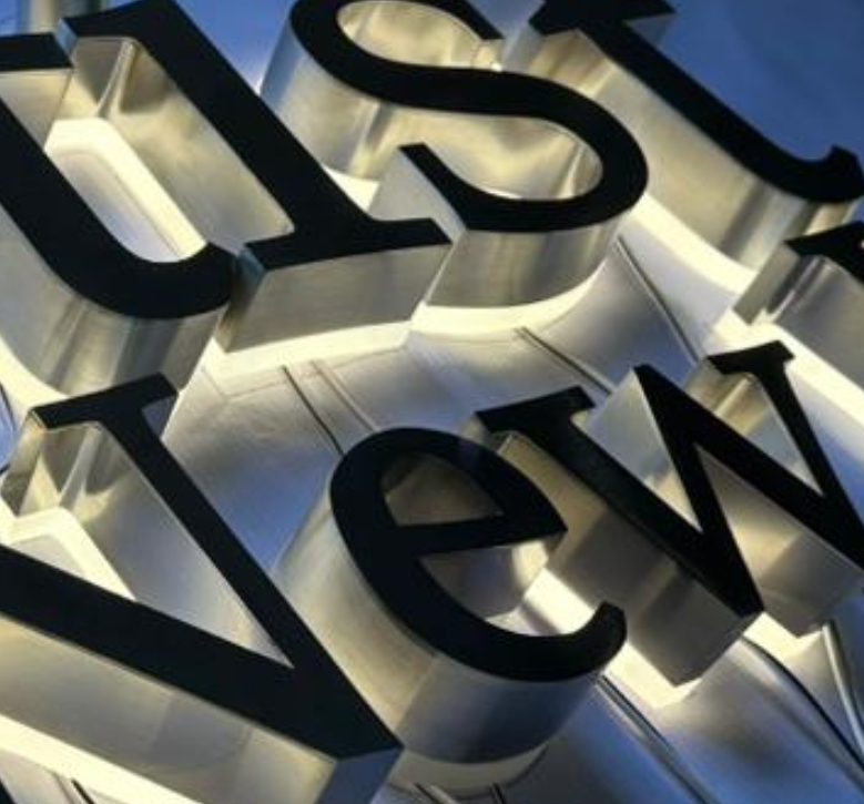
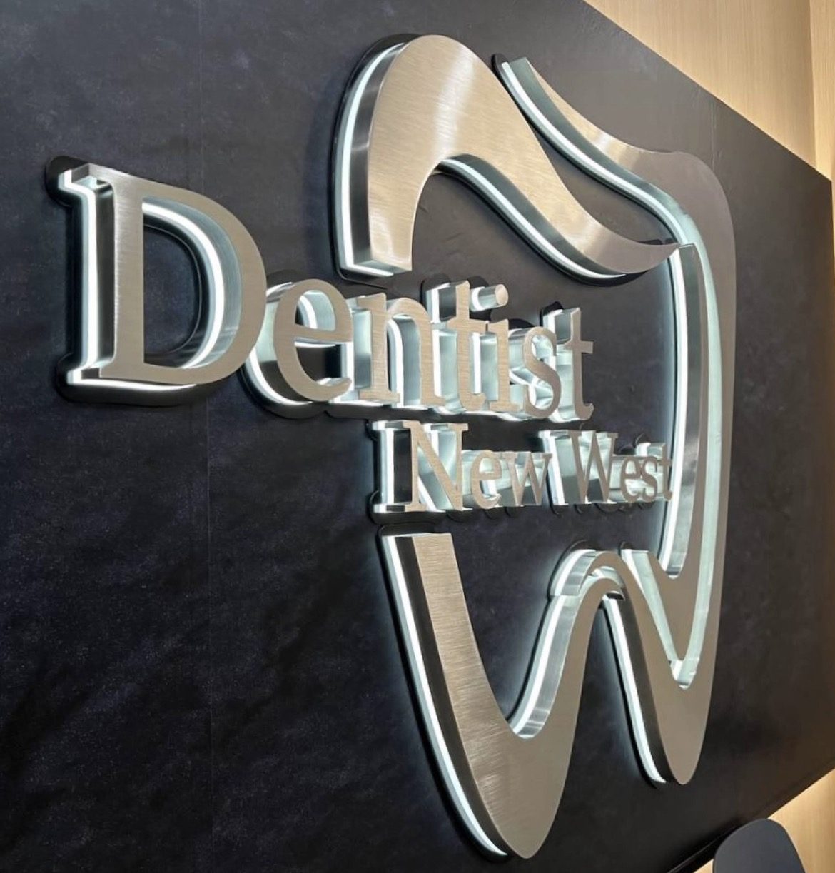
| Light with no source | The render glows evenly from inside. A real channel letter needs room for LEDs, a return deep enough to diffuse them, and a path for the wiring. |
| Returns and reveals | The render implies a depth and edge finish that was never specified. We decide it properly — face-lit, halo-lit, or both — and show you what each looks like. |
| No mounting logic | The picture never answers how it attaches to the wall, where the power comes from, or how it survives wind and rain. |
We take the look you wanted and work out the version of it that can be built, lit, mounted and serviced — then show you a scaled proof on a photo of your actual building before anything is cut.
AI wrap mockups are the most seductive of all. A perfect side-on view of a van, graphics flowing beautifully from front to back.
Real vehicles are not flat side-on views. They have door handles, mirrors, fuel doors, panel gaps, deep body curves, window lines and bumper breaks. A design generated without those lands on the real van with your phone number cut in half by a door seam, your logo wrapped around a handle, and the flowing swoosh disappearing into a recess.
We work from actual vehicle templates for your exact make, model and year — the real panel outlines — and lay the design onto that. Then we move the important things (name, phone, website) onto flat, readable panels and let the decorative parts flow around the obstacles. You see it on the real template before we print a metre of vinyl.
There is a second problem too: a wrap is read from a moving car at thirty or forty kilometres an hour, from across a lane. Detail that looks rich in a thumbnail disappears entirely. We will tell you which parts of your design will simply not be seen, and give that space to the things that matter.
AI is very good at rendering a material and very bad at respecting how it behaves. We work in acrylic, wood, aluminium, stainless, PVC and aluminium composite, and each one answers to its own rules.
| Brushed metal | In a render it is a flat texture that always looks the same. Real brushed stainless or aluminium changes with the light and the viewing angle — which is usually better than the render, but different. The alternative is printing a metal look, which stays flat in any light. We will show you both. |
|---|---|
| Wood | Real wood has grain direction, knots and movement. A fine detail that cuts perfectly across the grain can split along it. Outdoors, wood needs sealing and will weather. We choose the species and the cut direction around your design. |
| Acrylic | Renders show idealised glass — perfectly clear, perfectly even. Real acrylic has edge colour, and that is often the best part of it. Clear, frosted, mirrored, edge-lit and push-through all look completely different in daylight and at night. |
| Aluminium & composite | Flat panel work with clean routed edges. Strong, light and weatherproof — but it is a sheet, so a design that implies carved depth needs to be built up in layers instead. |
This is the single thing most likely to change how your sign has to be built, and almost nobody expects it.
A gradient cannot be cut. Cut vinyl and routed letters are solid colour — one colour per piece. If your AI logo fades from purple to blue, it cannot be made as cut lettering at all. It has to be printed, which means a printed panel or printed vinyl applied to a substrate. That is a different sign, with a different look, a different price and different edges. We will tell you this at the start, not after you have fallen in love with the drawing.
Glow is not a material. A render can make an edge luminous with no bulb behind it. In real life, glow comes from LEDs, and LEDs need depth, diffusion and power. Sometimes we can get very close with halo lighting or edge-lit acrylic. Sometimes the honest answer is that the render shows something that only exists on a screen.
Transparency on glass behaves differently again. A semi-transparent overlay in a render becomes, in reality, a choice between frosted film, perforated film you can see out through, or printed vinyl with a white ink layer behind it so the colours stay solid. Each one looks different from inside than from outside — and the render only ever shows one side.
Large flat colour and smooth fades can also show banding when printed big. We print on our own HP Latex equipment, so we can test a section at full size before committing a whole panel.
Before you pay for anything, we will tell you plainly: this part of your design will build beautifully, this part needs changing, and this part is not possible in the material you are imagining.
Nobody enjoys hearing that. But it is much cheaper to hear it at the start than to see it on your wall.
Sometimes, at small sizes. For anything large, or anything cut or fabricated, it needs redrawing first. Send it over and we will tell you which case you are in before you commit to anything.
You can, and for a quick mock-up it is fine. For something that gets cut or routed, auto-traced artwork gives lumpy edges and hundreds of unnecessary points. Machines follow the file exactly — including its flaws.
It depends on how much work the artwork needs. A simple logo cleanup is different from rebuilding a complex 3D render as a buildable sign. We quote it clearly up front, separately from the fabrication, so you can see exactly what you are paying for.
Yes. It is your artwork. Keep it for future signs, print, embroidery or anything else.
Screens emit light; ink and vinyl reflect it. Very bright blues, greens and neon tones often cannot be matched exactly. We will show you the closest real match before printing, not after.
Usually yes, with adjustments. Stroke widths, depths, lighting and mounting all need to be made real. We will show you a scaled proof of the buildable version.
We can use it as a direction. We will rebuild it on the real template for your exact make, model and year so nothing important lands on a door handle or a panel gap.
Yes. It makes no difference which tool you used — they all produce a flat pixel image rather than production artwork, so the work on our side is the same. If you built it in Canva, send us the Canva file rather than a screenshot; some of it may already be vector, which saves you money.
Sometimes. If the AI image is mostly a mood rather than a design, starting clean is often faster and cheaper. We will say so honestly rather than charging you to untangle it.
Caspian Signs & Graphics carries liability insurance and WorkSafeBC coverage, so your project is protected from start to finish.
Or call +1 236-591-3235 — we answer during shop hours.
Also see: Channel Letters | 3D Letters | Vehicle Wraps | Large Format Printing | Sign Company in Vancouver, BC